Luxury visual identity: what it is and what it needs to do

Updated: Sep 12
A customer usually sees the luxury brand before they understand it.
They see the packaging, website, photography, typography, color, layout, product page, social content, or retail material before they know the full story behind the product.
That first visual layer does a lot of work.
It tells the customer whether the brand feels careful, credible, considered, rare, expressive, restrained, technical, cultural, expensive, or generic.
A luxury visual identity is the system behind that first impression.
It is not only the logo. It is not only the color palette. It is not a set of expensive-looking design choices.
It is the way the brand uses typography, color, imagery, layout, packaging, materials, and digital standards to shape perception across every visible touchpoint.
That is why luxury visual identity cannot be treated as decoration.
It has to prove the level the brand wants to occupy.
What is luxury visual identity?
Luxury visual identity is the visible system that helps a brand communicate quality, distinction, trust, and value.
It includes the design elements people can see: logo, typography, color, imagery, packaging, layout, materials, digital design, and application standards.
But the important part is not the list of elements.
The important part is how they behave together.
A luxury visual identity should help the brand feel recognizable across different formats. It should guide how information is organized, how products are presented, how quality is signaled, and how the brand appears across packaging, website, content, campaigns, and customer-facing materials.
A luxury visual identity decides how the brand is seen.
That difference matters because luxury perception is rarely created by one asset. It is created by repeated visual signals that feel intentional, consistent, and appropriate for the product, price, audience, and buying situation.
Luxury visual identity vs luxury brand identity
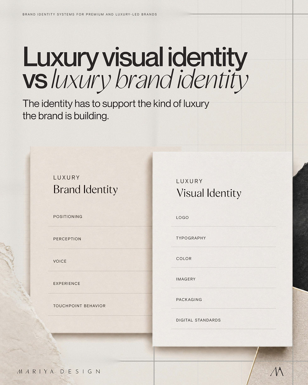
Luxury visual identity and luxury brand identity are closely connected, but they are not the same thing.
Luxury brand identity is the wider system behind the brand. It includes positioning, perception, values, voice, customer experience, product presentation, touchpoint behavior, and visual standards.
Luxury visual identity is the visible part of that system.
It includes the logo, typography, color system, image direction, layout logic, packaging hierarchy, material cues, digital standards, and the way those elements are applied across real customer-facing touchpoints.
The visual identity is not the whole brand.
But it is often the part customers judge first.
That is why it has to do more than look beautiful. It has to make the brand easier to recognize, understand, trust, and value.
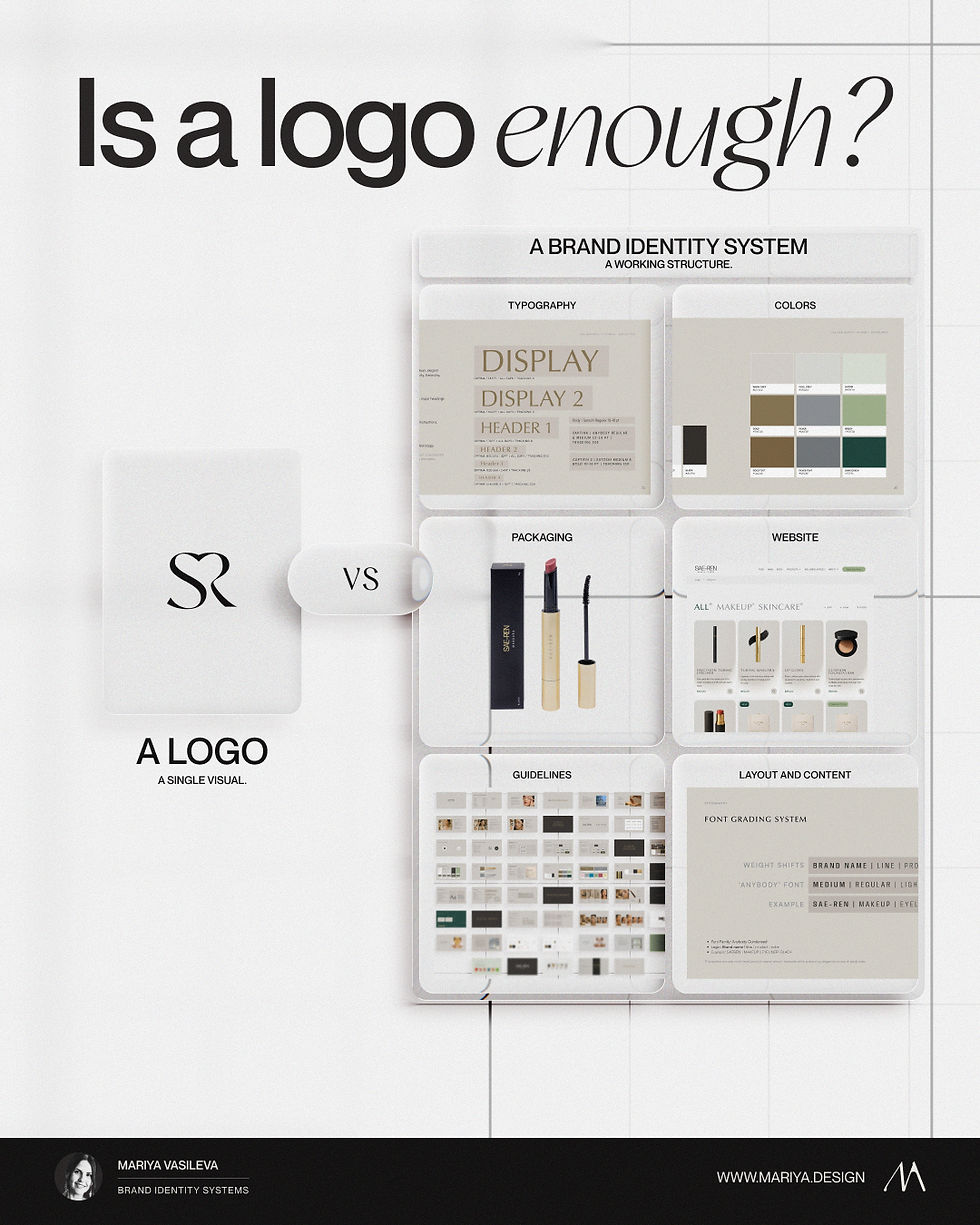
Luxury visual identity vs logo design
A luxury logo can be beautifully drawn and still not be enough.
The logo may look refined on a website header, packaging label, social profile, or business card. But the brand still has to work in many other places.
A product page needs hierarchy. A packaging system needs structure. A campaign needs flexibility. A website needs digital standards. A product range needs clear organization. A content system needs recognition.A supplier needs usable rules.
The logo cannot make all of those decisions.
That is the job of the visual identity system around it.
Luxury logo design gives the brand a sign. Luxury visual identity gives the brand a way to show up with control across every visible touchpoint.
For a very early brand, a logo and simple visual direction may be enough for a short time. But once the brand has packaging, digital, content, product lines, campaigns, or customer-facing complexity, the logo becomes too small as the main solution.
The brand needs more than recognition.
It needs visual logic.
Luxury visual identity vs brand guidelines
They are not the identity itself.
A guideline document may show logo usage, color codes, typography, spacing, examples, and basic do’s and don’ts. That can be useful. But a luxury visual identity needs to exist as a working system before it can be documented well.
This is where many brands get confused.
They ask for guidelines when the real problem is that the identity system underneath is thin.
A polished PDF cannot create structure if the brand does not already have typography rules, color roles, packaging hierarchy, image direction, layout logic, and digital behavior defined.
Good guidelines help people use the identity.
They do not magically turn scattered design choices into a luxury visual identity.
Luxury visual identity is not one style
Luxury is not one visual style.
This is where a lot of weak luxury branding starts.
A brand wants to look more expensive, so it borrows surface signals: serif typography, muted colors, gold, black packaging, large spacing, soft neutrals, minimal layouts, editorial photography, or elegant mockups.
None of those choices are wrong.
Gold can work. Beige can work. Black can work. Minimalism can work. Ornament can work. A serif typeface can work. A bold color system can work.
The problem starts when those choices are used as shortcuts.
A heritage-led brand, a clinical skincare brand, a boutique wellness product, a luxury food brand, a fragrance house, a hotel, a jewelry studio, and a tech-driven premium brand should not all look the same.
Some luxury brands need restraint.Some need sensory richness.Some need technical precision.Some need cultural depth.Some need warmth and intimacy.Some need visible innovation.Some need silence and space.Some need strong material presence.
The visual identity has to support the kind of luxury the brand is building.
Without that decision, luxury branding becomes a costume.

What a luxury visual identity needs to control
A luxury visual identity should control more than the general mood.
It needs to define how the brand behaves when it leaves the first presentation and starts appearing in real situations.
That includes how typography creates hierarchy, how color is used for recognition and emphasis, how imagery supports perception, how packaging explains the product, how website layouts organize trust, and how future materials stay connected to the same brand.
This control does not make the brand stiff.
It makes the brand easier to use.
A luxury visual identity should be able to flex across formats without losing its character. Packaging should not look identical to the website. Social content should not look identical to a product page. A campaign can have more energy than a core brand page.
But the logic should remain recognizable.
The customer should feel that the same level of care exists everywhere.

Want the deeper breakdown?
Download The Luxury Brand Identity System Guide — a free guide to the structural elements behind premium brands that look consistent, credible, and ready for the next stage.
Typography has to do more than look elegant
Typography is one of the fastest ways a luxury visual identity becomes credible, or starts to feel generic.
A typeface choice matters, but type behavior matters more.
The question is not only whether the brand uses a serif, sans serif, script, or custom wordmark. The question is how typography handles hierarchy, pace, density, contrast, product information, and tone across different touchpoints.
A luxury skincare brand may need typography that feels clinical and calm, but still human. A fragrance brand may need something more atmospheric. A premium food brand may need warmth and appetite, not cold minimalism. A luxury service brand may need trust and editorial authority.
The same typeface can look premium in one system and weak in another.
It depends on how it is used.
Too much spacing can feel empty. Too little hierarchy can feel careless. A refined font used without control can still look amateur. A beautiful wordmark cannot compensate for product pages, labels, or social content where the typography behaves randomly.
Luxury typography is not about choosing an expensive-looking font.
It is about making type carry the right level of authority, rhythm, restraint, and clarity.
Color has to have a job
Color in a luxury visual identity is often misunderstood.
People treat color as mood first.
But in a working brand system, color needs a job.
It can create recognition. It can separate product lines. It can control hierarchy. It can support category cues. It can signal temperature, material, flavor, function, ritual, energy, calm, or technical precision.
A palette can be beautiful and still fail if the colors do not have roles.
This is where many luxury-led brands become inconsistent. The colors look good in the brand presentation, but in application they are used differently every time. One launch uses the accent color heavily. Another uses only neutrals. The website uses the palette decoratively. Packaging uses it structurally. Social content adds extra colors because the original system does not have enough range.
The issue is not the colors themselves.
The issue is the missing color logic.
A luxury visual identity needs to define which colors lead, which support, which are used for emphasis, which create product separation, and where restraint is necessary.
Color should not be there only to make the brand look expensive.
It should help the brand behave consistently.
A structured color starting point for designers and brands
49 Luxury Color Systems is a designer-built collection of role-led palettes for branding and packaging. Each system defines ANCHOR, PARTNER, WEAPON, and FOUNDATION roles, then studies how the direction behaves across materials and real applications.
For a brand identity project, I can begin with a matching direction and adapt the palette around the brand's positioning, product, materials, packaging, website, and content, or develop a new custom color system.
Imagery shapes the world around the brand
Imagery carries a lot of luxury perception.
It affects how close the brand feels, how sensory the product feels, how technical the offer feels, how much atmosphere exists around the product, and how the customer imagines using it.
This includes product photography, lifestyle imagery, textures, materials, model direction, cropping, lighting, backgrounds, retouching, motion, and the relationship between image and typography.
A luxury visual identity needs an image direction that is specific enough to guide future content.
“Beautiful photography” is not enough.
What kind of beauty?What kind of light?What kind of distance?What kind of material presence?What kind of human presence?What should feel controlled, and what should feel natural?What should never appear because it weakens the brand?
Without that direction, imagery becomes one of the easiest places for the brand to drift.
A product can look premium in one shoot and generic in the next. A website can feel considered while social content feels borrowed from trends. A campaign can look attractive but disconnected from the brand’s actual identity.
Luxury imagery needs to do more than decorate the page.
It has to build the world the product belongs to.
Packaging gives physical proof
For product-led luxury brands, packaging is often where the visual identity becomes physical.
It is where typography, color, hierarchy, materials, finish, structure, and information design have to work together.
In beauty, fragrance, wellness, and lifestyle categories, packaging is often where the visual identity becomes the most tangible. For example, the SAE-REN case study shows how a luxury beauty identity can extend into packaging, product hierarchy, and system-led execution.
Packaging has to make the product understandable and desirable. It has to support the price. It has to hold up in photography, ecommerce, retail, shipping, unboxing, and repeat use. It has to explain the product without making the brand feel crowded or generic.
Luxury packaging is not only about expensive materials.
A beautiful paper, foil, embossing, glass bottle, rigid box, or refined label can help. But materials cannot save weak hierarchy.
The customer still has to understand what the product is, which variant they are holding, what matters most, and why the product deserves attention.
This is where packaging hierarchy becomes part of the luxury visual identity.
It decides what leads, what supports, what stays quiet, and how the product range remains recognizable as it grows.
A luxury package should not only look good in isolation.
It should belong to a system.

Digital presence is where luxury perception often breaks
A brand may look premium in packaging and weaker online.
This is common.
Packaging gets careful attention. The website is built later, often through a template, a developer, or a different team. The product page carries too much information. The typography changes. The spacing feels less controlled. The imagery is strong, but the surrounding layout weakens it.
The customer does not see those as separate production issues.
They see one brand.
If the packaging feels luxury but the website feels generic, trust weakens. If the product looks expensive but the checkout experience feels careless, the brand sends mixed signals. If social content looks like a different brand every week, recognition becomes harder.
Luxury visual identity has to include digital standards.
Not because the website should copy the packaging.
Because the website has to continue the same level of care.
Digital standards define how the brand behaves in product pages, navigation, modules, buttons, content blocks, campaign pages, email, and mobile layouts.
Luxury is not only judged in the hero image.
It is judged in the details of use.
Premium visual identity vs luxury visual identity
Premium and luxury are related, but they are not identical.
A premium visual identity usually signals higher quality, better execution, stronger trust, and more considered presentation than the mainstream category around it.
A luxury visual identity usually carries a more specific level of perception. It may need to communicate rarity, restraint, heritage, craft, cultural value, service, exclusivity, innovation, atmosphere, or status.
Not every premium brand needs to behave like a luxury brand.
A premium supplement brand, expert-led wellness clinic, modern food brand, or professional beauty product may need credibility, clarity, trust, and polish without becoming overly rare, distant, or exclusive.
That distinction matters.
Forcing luxury codes onto a brand that only needs premium clarity can make the identity feel unnatural. It may become too cold, too empty, too formal, or too disconnected from the customer.
The goal is not always to look luxury.
The goal is to support the correct level of perception.
Not every premium brand needs to behave like a luxury product brand; expert-led and service brands often need credibility, trust, and consistency more than rarity.
What makes a luxury visual identity credible?
Credibility comes from alignment.
The product, price, brand story, customer experience, packaging, website, and visual system need to support each other.
A luxury visual identity starts to feel credible when the design choices make sense for the brand’s position.
The typography matches the level of authority or atmosphere the brand needs. The colors have clear roles. The imagery feels specific to the product world. The packaging hierarchy supports the buying decision. The website continues the same quality. The guidelines prevent the brand from becoming a different version of itself every time something new is made. A brand may have a good product and still fail to prove its value visually.
Customers may not analyze each part consciously.
But they feel when the system is controlled.
They also feel when the brand is borrowing luxury signals without having the structure to hold them.
That is when luxury branding starts to look forced.

When luxury visual identity needs a system
A simple visual direction may be enough at the very beginning of a brand.
But once the brand has multiple products, packaging formats, website pages, campaigns, content, sales material, vendors, or future launches, visual direction alone becomes too light.
The brand needs a system.
A luxury visual identity system defines how the brand should look and behave across real touchpoints.
It gives the logo context. It gives typography rules. It gives color roles. It defines image direction, packaging hierarchy, layout behavior, digital standards, application logic, and guidelines for future execution.
This is what keeps the brand from depending on individual interpretation every time a new asset is created.
A luxury visual identity should not only look impressive at launch.
It should help the brand stay credible after launch.
That is the real test.
Not whether the brand looks expensive in one presentation.
Whether it still feels clear, valuable, and recognizable when it is used everywhere else.
If the brand already exists, it is worth diagnosing whether the issue is the identity, execution, packaging, website, or the wider system.
Start with diagnosis
A luxury visual identity should not be judged only by a logo, palette, or hero image.
It needs to create a credible level of perception across packaging, website, content, product hierarchy, and customer experience.
If the visual identity looks polished but the brand still feels generic, fragmented, or difficult to trust, the next step is not automatically a redesign.
The first step is identifying where the system stops supporting the perception.
Does the positioning support the level of luxury the visuals promise?
Are the typography, color, imagery, and layout roles clear?
Do packaging and website continue the same visual logic?
Does the identity feel specific to the product and audience?
Can teams and vendors apply it without weakening the brand?
Can the system expand without becoming generic or inconsistent?
That is what the Strategic Brand Audit is designed to clarify.
Need to understand whether the issue is the visual identity, its execution, or the wider system?
I’ll review the identity, applications, and customer journey, then recommend the right starting point.