SAE-REN — Luxury beauty identity, packaging, and brand system
SAE-REN is a luxury beauty brand identity and packaging system built for a beauty lounge, skincare collections, makeup line, full-fidelity website, spa environment, and international vendor rollout. The project included identity design, skincare and makeup packaging architecture, a 19-page Figma website design, production specifications, and a 50+ page brand guideline system.
Client
SAE-REN Beauty Lounge
Sector
Luxury Beauty, Cosmetics, Wellness Retail
Main Market
Singapore, South Asia
Timeframe
2024 to 2025, 12 months from concept to full rollout
Engagement
The Vault — Brand Identity System, Afterbranding — Implementation Support, Packaging Architecture
What I created
Brand identity system, Logo hierarchy and usage rules, Typography and color system, Skincare packaging architecture, Makeup packaging system, Multi-SKU product logic, Full-fidelity 19-page website design in Figma, Spa/interior brand translation, Vendor-ready production specifications, 50+ page brand guidelines, 12-month rollout and implementation support, AI-assisted pre-photography visuals
The launch problem
SAE-REN was not launching with one logo and one product.
The brand had to work across:
a physical beauty lounge
multiple skincare collections
a makeup line
retail packaging
international manufacturers
a 19-page digital presence
Each part needed to feel like the same luxury beauty brand.
Without a clear identity and packaging system, every product line, vendor, finish, and digital page could have started drifting in a different direction.
This is where a full brand identity system becomes more useful than a logo, because the brand needs rules for products, vendors, digital pages, and future expansion.
Objective
Build a luxury beauty identity and packaging system that could hold across skincare, makeup, spa environment, website, and multi-region production without every new product or vendor handoff becoming a new design problem.
For brands still defining the direction before execution, I usually begin with a Brand Direction Blueprint.
For brands that already exist and feel inconsistent, the better first step is often a Strategic Brand Audit.
What was built
A complete luxury beauty system covering identity, packaging, website design, spa/interior translation, production rules, and brand guidelines.
This type of full-system work sits inside The Vault — Brand Identity System.
Identity system
The identity was not designed as a visual style. It was structured as a decision system.
Every element answers:
what is fixed
what can change
what must never change
logo architecture and hierarchy
typography and layout logic
color system with defined roles
material and finish specifications

Skincare packaging system
A structured packaging system was developed to support multi-SKU expansion without redesign. The system defines how packaging decisions are made, not just how packaging looks.
Each skincare line included:
Packaging hierarchy
Insert and sleeve systems
Bottle and ampoule grading
Extension logic for future SKUs
New SKUs were not treated as separate design problems. They were integrated into a predefined packaging logic.


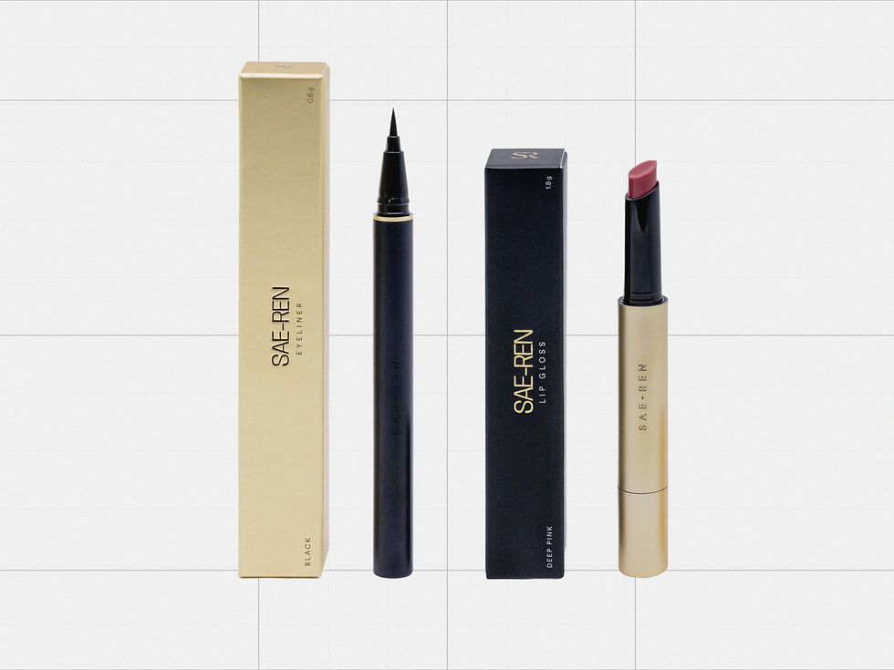
Makeup packaging system
Makeup introduced a secondary identity layer:
Black matte as structural base
Gold deboss primary logic
Inverse metallic rule for premium tier
Component consistency across eyeliner, mascara, lip gloss, blush
The system controlled finish, not just form, so new makeup products could follow the same logic instead of becoming separate styling decisions.


Website and product catalog structure
SAE-REN’s digital presence was designed as a full-fidelity 19-page website in Figma.
The website translated the same brand system into a complete digital experience across skincare, makeup, spa services, product education, and brand content.
The structure included:
19 defined pages
product catalog logic
page hierarchy
layout rules
backend organization
scalable navigation for future product lines
This allowed skincare, makeup, spa services, and product information to sit inside one coherent luxury beauty experience.

Spa and interior brand translation
The spa environment followed the same documented rules:
Material palette control
Typography usage
Color hierarchy
Metallic application logic
Physical and product environments remain aligned.

Production rules for vendors
Luxury beauty packaging can fall apart in production when vendors interpret finishes differently.
For SAE-REN, the system included production rules for:
Pantone controls
foil behavior
deboss specifications
substrate behavior
approved metallic pairings
material constraints
This made the brand easier to execute across manufacturers without every supplier making separate visual decisions.


This is also why brand guidelines need to define production behavior, not only logo usage.
AI-assisted launch visuals before photography
Before SAE-REN had a complete photography library, I created AI-assisted visual assets to help the brand establish its launch atmosphere across digital and presentation touchpoints.
These visuals were not treated as random generated content. They followed the same identity rules as the rest of the system:
color hierarchy
material logic
product presentation style
treatment atmosphere
composition rules
luxury beauty restraint
consistency with packaging and spa environment
Once the brand began producing real photography, the visual direction remained clear because the AI-assisted assets had already defined the atmosphere, pacing, and treatment logic.


Brand guidelines and handoff
All rules were documented in a 50+ page brand manual to support production and internal usage.
The manual functioned as an execution tool for internal teams and vendors, not just a presentation document.

What was designed directly
For SAE-REN, I created the brand identity system and the core visual execution across identity, packaging architecture, typography, color roles, product hierarchy, full-fidelity website design, spa/interior translation, and vendor-facing brand documentation.
Production and manufacturing were coordinated through defined specifications so external vendors could execute without interpreting the brand from scratch.
Outcome
Within six months, SAE-REN:
expanded into a second location
added multiple SKUs across skincare and makeup
coordinated production across multiple regions
maintained consistency across packaging, digital, and physical touchpoints
avoided redesign as the product catalog grew
The system gave the brand a structure that could absorb growth without making every new product, page, or vendor handoff a new design problem.
This is the role of Afterbranding: keeping the identity consistent after the main system is built.


"Mariya is an absolute professional. She understood exactly what I wanted and delivered high-end work that exceeded my expectations. Her attention to detail and commitment to quality are truly exceptional. I am incredibly impressed with her work ethic and dedication. I highly recommend her for any project!"
Dror A.
SAE-REN Beauty Lounge (SBL)