Is a logo enough? Why a brand identity system matters

Updated: Aug 30
A founder can look at the logo and think the brand is fine.
And sometimes, visually, the logo is fine.
It may be recognizable. It may sit well on the website header. It may look good on a business card, a label, a social profile image, or the corner of a pitch deck.
The weakness usually appears later, when the brand has to do more than identify itself.
A logo cannot decide how a product line should be organized. It cannot control typography across a website, packaging, social content, and sales materials. It cannot tell a supplier how the brand should behave on a new format. It cannot stop a content manager from inventing a slightly different version of the brand every time a new post is needed.
That is where many brands start to drift.
The logo stays the same.
Everything around it starts making separate decisions.
What a logo can actually do
A logo is a sign.
Its job is to identify the brand clearly and recognizably. It gives the business a mark, a wordmark, a symbol, or a visual anchor people can connect to the company.
That matters.
A weak logo can make a brand feel amateur, unclear, generic, or difficult to remember. A strong logo can support recognition and give the brand a more defined presence.
But a logo is still only one part of the brand identity.
It does not automatically create consistency. It does not define the full visual language. It does not decide how the brand should look across packaging, digital, content, campaigns, product lines, internal documents, or customer-facing materials.
A logo can sit on all of those things.
It cannot design them.
That difference is where a lot of confusion starts.
The logo may be fine, but the brand still feels inconsistent
I see this often with growing brands.
The founder looks at the brand and knows something feels off. The website does not match the quality of the product. The packaging looks more considered than the social content. The pitch deck feels like a different company. The typography changes slightly across every format. The colors are technically the same, but they are used without hierarchy.
The first assumption is usually that the brand needs a better logo.
Sometimes it does.
But often, the logo is not the main problem.
The problem is that the brand has no clear execution logic around the logo.
No typography rules.
No color roles.
No packaging hierarchy.
No layout standards.
No image direction.
No guidance for what happens when the brand appears in a new format.
No clear distinction between what should stay fixed and what can flex.
So every new touchpoint becomes a small act of interpretation.
A designer interprets the brand one way. A developer interprets it another way. A packaging supplier adjusts it for production. A social media manager adapts it for trends. A founder makes a quick decision because something needs to go out today.
None of those decisions may look dramatic on their own.
Together, they slowly move the brand away from its intended standard.
That is brand drift.
Where logo-only branding starts to fall apart
A logo-only brand can survive for a while when the business is simple.
One offer. One website. One social profile. A few basic materials.
The pressure starts when the brand becomes more visible or more complex.
A second product line is added. Packaging needs variants. The website needs more pages. The brand starts using paid ads. Retail or wholesale materials are needed. A team member starts creating content. A supplier needs production files. A campaign needs a different format. A founder wants the brand to feel more premium without rebuilding everything.
At that point, the brand needs more than a mark.
It needs standards.
Not because standards are exciting. They are not.
They are useful because they reduce guessing.
A brand identity system gives people a way to make visual decisions without reinventing the brand every time.
Logo versus brand identity system
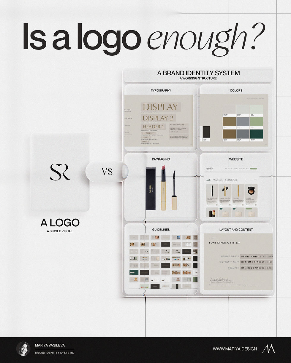
A logo identifies the brand.
A brand identity system defines how the brand behaves visually.
That system can include:
logo usage
typography rules
color roles
spacing logic
layout standards
image direction
packaging hierarchy
product line structure
website and digital behavior
campaign application rules
vendor and production guidance
customer-facing touchpoint standards
This is where the brand becomes easier to use.
The logo is no longer expected to do all the work. It becomes part of a wider structure.
The typography carries tone and hierarchy. The color system controls emphasis and recognition. The layout logic creates rhythm across formats. The packaging hierarchy helps customers understand the product. The guidelines show people what to do when the brand leaves the original design files.
That is the practical function of a brand identity system.
The aesthetic value comes after that.
A system can make the brand look more refined, more recognizable, more premium, or more deliberate. But those qualities come from repeated decisions working together, not from one attractive asset sitting in isolation.

Why premium brands expose weak systems faster
Premium and luxury-led brands are less forgiving when the system is weak.
That does not mean everything must look minimal, quiet, beige, expensive, or “timeless.” Those words are often used too lazily in branding.
Premium perception comes from control.
The customer may not consciously inspect the typography, spacing, packaging hierarchy, image style, or color logic. But they feel when the brand is handled with care. They also feel when it is not.
A product may be excellent, but if the label hierarchy is unclear, the website looks unfinished, the social content uses random styles, and the sales material feels disconnected, the brand starts sending mixed signals.
That creates a perception gap.
The business may be serious.
The product may be high quality.
The price may be justified.
But the visual system is not proving it consistently.
This is why premium identity work cannot stop at “make it look better.”
Better compared to what?
Better on which touchpoints?
Better for which buying situation?
Better under which execution conditions?
A serious brand identity system has to answer those questions.

A brand book is not always the same as usable guidelines
Many brands technically have guidelines.
That does not mean the guidelines are useful.
A polished brand book can show the logo, colors, typography, mockups, and a few sample applications. It may look impressive in a presentation. It may even help at launch.
But the real test comes later.
Can someone use it when a new product is added? Can a packaging supplier understand what should not change? Can a web designer build a new page without weakening the system? Can a social media manager create content that still feels like the brand? Can the founder judge whether a new asset is on-brand without relying only on taste?
If the answer is no, the document is more of a presentation than a working standard.
Useful guidelines do not only show what the identity looks like.
They explain how it should be used.
A redesign is not always the answer
When a brand feels inconsistent, a redesign can be tempting.
A new logo. A new palette. A new typeface. A cleaner website. A more premium direction.
Sometimes that is the right move.
Some identities are genuinely too weak, too generic, too dated, or too limited for the business they are trying to represent.
But a redesign should not be the automatic answer every time the brand feels messy.
The problem may be different.
The identity may be good, but incomplete. The guidelines may exist, but not explain execution. The packaging may have evolved while the website stayed behind. The team may be creating too many materials without clear standards. The founder may be reacting to inconsistency without knowing where it starts.
Those are not all the same problem.
They should not all lead to the same solution.
Before changing the logo, it is worth asking a more useful question:
Is the brand identity wrong, or is the system around it missing?
What to check before replacing the logo
Before deciding that the logo needs to change, I would look at the brand across real touchpoints.
Not just the logo file.
The website. The packaging. The product pages. The social content. The sales deck. The email templates. The ads. The printed materials. The customer-facing documents. The way the brand appears after launch, not only inside the original presentation.
Then I would check where the inconsistency is actually coming from.
Is the logo too weak for the positioning? Is the typography doing different things across every format? Are the colors used as decoration instead of roles? Does the packaging hierarchy support the buying decision? Does the website match the product quality? Do the guidelines answer execution questions? Are vendors and team members making avoidable guesses? Has the brand drifted because nobody owns the standards?
This kind of diagnosis is less exciting than jumping into a redesign.
It is also more useful.
Because once you know where the problem sits, you can decide what actually needs to change.

The logo is only enough when the brand does not need much from it
For a very early business, a simple logo and basic visual direction may be enough.
Not every brand needs a full identity system on day one.
A founder testing an idea does not always need a 60-page guideline document. A small service business with very few touchpoints may not need complex packaging logic, campaign standards, or product line rules.
There is no value in overbuilding a system before the business has enough pressure to need one.
But once the brand starts appearing in more places, the need changes.
The question is no longer only:
“Do we like the logo?”
The better question becomes:
“Can this identity hold the way the brand now needs to show up?”
That is where the logo alone becomes too small as a solution.
A better way to think about brand identity
A brand identity is not just the designed face of the business.
It is the visual decision-making system behind the business.
It decides how the brand is recognized, how information is organized, how quality is communicated, how product lines are separated, how digital and packaging connect, and how future materials should be created without weakening the whole thing.
The logo is part of that.
But it is not the full structure.
A brand becomes more consistent when the decisions around it are defined.
That is what a brand identity system is for.
It gives the brand a standard that can survive beyond the first presentation, the first launch, the first designer, and the first few polished mockups.
Because the real test of a brand is not whether the logo looks good on its own.
The real test is whether the brand still looks clear, credible, and recognizable when it is used everywhere else.
Before replacing the logo, it is worth checking whether the real problem is the logo, the wider brand identity system, or the way the brand is being executed across touchpoints.
Three possible answers after diagnosis
Once the wider system is reviewed, the answer is usually one of three:
Keep the logo and define the missing system around it.
Refine the logo while preserving recognition and useful equity.
Rebuild the identity when the current logo, hierarchy, and visual language no longer support the positioning.
The right decision depends on where the mismatch begins, not on whether a new logo feels more exciting.
See this in practice: Smile Rooms multi-location brand identity case study.
Start with diagnosis
If you are unsure whether the logo is the problem, diagnose the wider brand system before commissioning a redesign.
The Strategic Brand Audit clarifies what should be preserved, refined, rebuilt, or better structured before more execution is commissioned.
Need help choosing the right starting point?
I’ll review your brand and recommend the right starting point.