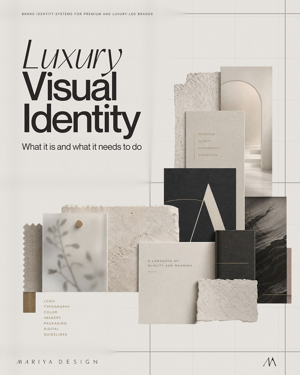
What Makes a Luxury Brand Identity Look Credible?

Updated: Sep 12
A luxury brand identity can look expensive and still not look credible.
That is the part many founders miss.
A refined logo, quiet palette, elegant serif, large spacing, soft photography, black packaging, gold detail, or minimal layout can all help a brand feel more premium.
But none of those choices prove anything by themselves.
They only work when they match the product, price, audience, category, and customer experience behind the brand.
When they do not, the identity starts to feel borrowed.
The brand looks like it is performing luxury, instead of showing why it belongs there.
Credibility comes from alignment.
The product, price, visual identity, packaging, website, and customer experience need to support the same level of perception. When one part overpromises and another part underdelivers, the customer feels the gap.
They may not call it a brand problem.
They may not notice the typography, color roles, hierarchy, or digital standards.
They simply hesitate.
That hesitation matters.
Luxury brand identity is not only about attraction. It is also about belief.

A luxury brand identity has to earn belief
Customers do not automatically believe a brand because it looks polished.
Polish is easy to imitate now.
A clean layout, a muted palette, nice mockups, an elegant typeface, and a few atmospheric images can make almost anything look more expensive for a moment.
The harder part is sustaining that impression across the whole brand.
A customer may first see the product in a social post. Then they open the website. Then they read the product page. Then they look at the packaging, reviews, email, shipping experience, or follow-up content.
Each touchpoint either strengthens the brand’s credibility or weakens it.
This is where luxury identity gets tested.
A brand can look beautiful in one hero image and still feel underbuilt once the customer moves through the actual experience. The homepage may look refined, but the product page may have weak hierarchy. The packaging may look considered, but the website may feel generic. The photography may look premium, but the information design may feel careless.
That is where credibility breaks.
Luxury customers are not only buying the surface. They are buying confidence, judgment, taste, care, and the feeling that the brand understands its own level.
A luxury brand identity has to make that believable.
If you are building or refining a premium brand, download The Luxury Brand Identity System Guide.
It explains the structural elements behind luxury-led brands that look consistent, credible, and ready for the next stage.
Download the Free Luxury Guide
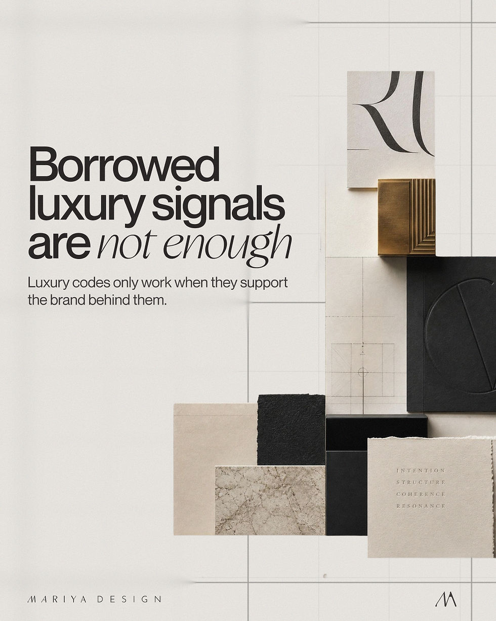
Borrowed luxury signals are not enough
There is nothing wrong with gold, black, beige, ivory, serif typography, large spacing, marble, editorial photography, or minimal layouts.
All of those can work beautifully.
The problem starts when they are used as shortcuts.
Gold is not credibility. Minimalism is not credibility. A serif font is not credibility. Muted color is not credibility. Expensive-looking packaging is not credibility.
They are signals.
Signals only work when they are connected to something real.
Gold may support ceremony, rarity, warmth, or emphasis. Minimalism may support restraint, confidence, or product clarity. A serif typeface may add editorial authority, heritage, or contrast. Beige may create softness, material warmth, or calm.
But if those choices are not connected to the product, audience, category, price, and customer journey, they start to look like costume.
This is why some luxury branding feels forced.
The visual codes are recognizable, but the reasoning behind them is weak.
The brand borrowed the language of luxury without building the structure that makes the language believable.
Credibility starts with alignment
A credible luxury brand identity feels aligned from the inside out.
The offer, product, price, visual identity, packaging, website, content, and customer experience all need to support the same perception.
That does not mean everything has to look identical.
Packaging and website do different jobs. A campaign can have more energy than a core product page. Social content can be more flexible than packaging. A launch moment may use stronger imagery than the everyday brand system.
But the underlying logic should stay recognizable.
The customer should not feel like they are moving between different brands.
A luxury skincare brand should not look clinical on packaging, romantic on the website, playful on social, and generic in email unless that contrast is deliberate and controlled. A premium food brand should not signal craft on pack and then use a product page that feels like a discount template. A luxury service brand should not promise a high-touch experience while its digital presence feels rushed or unclear.
Credibility comes from the sense that the brand knows what it is doing.
That is not only an aesthetic impression.
It is a structural one.
The product, price, and presentation need to agree
One of the fastest ways to weaken luxury perception is a mismatch between product quality and visual presentation.
A product may deserve a higher price, but the brand may not be proving it clearly enough.
The packaging may not communicate the level of care. The website may not create enough trust. The typography may feel too generic. The product page may explain the offer poorly. The photography may be beautiful but disconnected from the actual product experience.
When that happens, the customer has to work harder to believe the price.
Luxury identity should reduce that friction.
It should make the product easier to understand, easier to trust, and easier to place at the right level in the customer’s mind.
This does not mean making everything look expensive for the sake of it.
It means making the presentation appropriate to the value being claimed.
A $40 product, a $400 product, and a $4,000 service cannot rely on the same level of visual proof. The higher the price and the more considered the offer, the more the brand identity has to carry trust before the customer has direct experience.
A credible luxury brand identity helps the price feel supported.
Not inflated.
Supported.
Typography has to carry authority, not decoration
Typography can make a luxury brand feel confident very quickly.
It can also expose weakness just as quickly.
A beautiful font is not enough. The way type behaves matters more than the typeface itself.
Luxury typography needs control. It needs hierarchy, rhythm, spacing, contrast, and restraint. It needs to help the customer understand what matters first, what supports it, and how the brand speaks across different formats.
A refined wordmark does not help much if the product page uses type without hierarchy. An elegant serif can look generic when it is dropped into every heading without judgment. Large spacing can feel luxurious in one place and empty in another.
The question is not “Does this font look luxury?”
The better question is:
Does the typography create the right level of authority, clarity, and atmosphere for this brand?
For some luxury brands, typography needs to feel editorial and cultural. For others, it needs to feel precise and technical. For beauty, wellness, food, hospitality, service, or lifestyle brands, the typographic tone can shift significantly.
There is no single luxury type formula.
There is only the right typographic behavior for the brand’s position.
Color needs restraint, contrast, and role
Color is often treated as a mood decision.
For luxury identity, that is not enough.
A credible color system needs roles.
It needs to define what leads, what supports, what creates emphasis, what separates products, what builds recognition, and where restraint matters.
A luxury palette can be neutral, dark, colorful, warm, clinical, earthy, rich, or quiet. The palette itself is not the whole answer.
The issue is how it behaves.
A brand can have beautiful colors and still look inconsistent if they are used differently on packaging, website, social content, and campaigns. A muted palette can feel refined when it has depth and contrast, or flat when it becomes generic. A bold color can feel luxury when it is controlled, or cheap when it is used without hierarchy.
The color system should help the brand become easier to recognize.
It should not simply decorate the surface.
This becomes more important when the product range grows. Without color roles, every new variant, collection, campaign, or website section becomes a fresh decision.
That is how visual identity starts to drift.
Explore a color system before building the full identity
49 Luxury Color Systems shows how color roles, proportion, material behavior, and application logic can work together before typography, imagery, packaging structure, and digital standards are added.
For a client identity, a matching system can become the starting direction and then be adapted to the brand's needs. When no existing direction fits, I develop a new custom palette as part of the identity system.
Packaging gives physical proof
For product-led luxury brands, packaging is one of the strongest credibility signals.
It is where the brand becomes physical.
The customer can see the structure, material, finish, label hierarchy, product information, and level of care. Even before opening the product, packaging tells them whether the brand understands the price it is asking for.
But luxury packaging is not just expensive materials.
A rigid box, foil, embossing, glass bottle, textured paper, or custom closure can all support perception. But materials do not replace hierarchy.
The customer still needs to understand what the product is, which variant they are holding, what matters most, and why the product deserves attention.
A package can be beautiful and still fail if it is hard to read, poorly structured, or disconnected from the rest of the brand.
Credible luxury packaging does two things at once.
It creates desire.
And it gives information enough discipline to support trust.
Digital presence has to continue the promise
This is where many luxury-led brands weaken.
The packaging is considered. The product photography is strong. The identity looks good in the launch presentation.
Then the customer reaches the website.
The product page feels generic. The typography shifts. The spacing is less controlled. The color palette is used differently. The mobile experience feels crowded. The checkout or email layout looks like it belongs to another brand.
That gap matters because digital presence is not secondary anymore.
For many brands, the website is where the customer confirms whether the brand is real, credible, and worth buying from.
The package may start the promise, but the website has to continue it.
A luxury brand identity needs digital standards for that reason.
Not because the website should copy the packaging.
Because the same level of care has to translate into navigation, product pages, modules, calls to action, email, campaign pages, and mobile behavior.
Luxury is not only judged in the hero section.
It is judged in the details of use.

Consistency is what makes the identity believable
Consistency is not about making every asset look the same.
That would make the brand stiff.
Consistency means the decisions come from the same system.
The typography behaves with the same logic. The colors have roles. The imagery belongs to the same world. The packaging and website support the same level of perception. The product range is organized clearly. The customer does not have to keep recalibrating what kind of brand they are looking at.
This is especially important for luxury and premium brands because inconsistency makes the brand feel less controlled.
And control is part of the perception.
When a luxury brand changes tone, style, hierarchy, or quality level from one touchpoint to another, the customer may not identify the specific issue. But they feel the brand is less certain.
That weakens trust.
A credible luxury identity does not need to be predictable.
It needs to be coherent.
When luxury identity starts to look forced
Luxury identity starts to look forced when the visual signals are stronger than the substance behind them.
The brand may use refined typography while the product architecture stays unclear. The packaging may look expensive while the website feels unfinished. The palette may be elegant, but without a role system. The photography may be atmospheric, while the product information remains weak.
This is when the identity feels like styling rather than strategy.
The problem is not that the brand wants to look luxury.
That is a valid goal if the product, price, audience, and experience support it.
The problem is when the brand tries to perform luxury through isolated signals instead of building a complete perception system.
A credible luxury brand identity does not need to shout.
But it does need to make sense.
Two luxury branding traps weaken credibility
Overdecorated opulence
The first trap tries to prove value through accumulation. Ornamental type, metallic effects, decorative borders, dramatic photography, monograms, textures, and multiple prestige cues all compete for attention. Each element may be associated with luxury, but together they can make the brand feel anxious to convince. The customer sees the signals before they understand the product.
Default minimalism
The second trap removes so much that the brand loses specificity. A neutral palette, centered serif wordmark, large spacing, and quiet photography may look polished, but without distinctive hierarchy, material logic, voice, or product architecture, the identity could belong to almost any premium brand. Restraint becomes generic rather than confident.
Refined luxury sits between excess and absence
Credible luxury uses fewer signals with more intention. It decides what carries authority, what creates desire, what provides proof, and what stays quiet. The result does not need to be minimal or ornate. It needs to feel controlled, specific to the offer, and consistent with the price and experience. That is how a brand avoids looking decorated at one extreme and anonymous at the other.
A credible luxury brand identity needs a system
Luxury perception is fragile when it depends on isolated visuals.
A good logo helps. A beautiful palette helps. Strong packaging helps. A polished website helps.
But if those pieces are not connected, the brand will eventually start to fragment.
A luxury brand identity system defines how the brand should look, feel, and behave across real touchpoints.
It gives the logo context. It gives typography rules. It gives color roles. It gives packaging hierarchy, image direction, layout logic, digital standards, and practical guidelines for future use.
That is what helps the brand stay credible after launch.
Not only in the first presentation.
Not only in the hero image.
Not only in the packaging mockup.
Everywhere the customer meets it.
A credible luxury brand identity is not built by borrowing luxury signals.
It is built by aligning the visible brand with the product, price, audience, category, and experience behind it.
That is what makes the identity believable.
See this in practice: SAE-REN luxury beauty brand identity case study.
Start with diagnosis
A luxury brand should not rely on visual polish or familiar luxury signals alone.
The product, price, story, packaging, website, and customer experience need to support the same level of perception.
If the brand looks refined but still feels generic, inconsistent, or difficult to trust, the next step is not automatically another visual refresh.
The first step is identifying where credibility breaks.
Does the positioning justify the price?
Does the packaging carry the same level of refinement as the identity?
Does the website continue the promise created by the product and packaging?
Are the luxury cues distinctive to the brand rather than borrowed?
Can the system stay credible as the brand expands?
That is what the Strategic Brand Audit is designed to clarify.
Need to understand what is weakening luxury perception across the brand?
I’ll review the positioning, identity, packaging, and customer journey, then recommend the right starting point.