What Is a Brand Identity System? A Practical Guide for Premium Brands
- Mariya Vasileva

- Apr 26
- 7 min read
Updated: 1 day ago
A brand can look polished and still feel inconsistent.
The logo may be strong. The colors may look refined. The website may be well designed. The packaging may photograph beautifully.
But once the brand has to work across products, campaigns, content, teams, vendors, and customer-facing materials, visual quality alone is not enough.
A premium brand needs structure behind the visuals.
That structure is the brand identity system.
It defines how the brand should look, behave, adapt, and stay recognizable across real use. Not only in the presentation. Not only in the first launch assets. Not only when the founder or designer is personally controlling every decision.
A brand identity system makes the brand easier to apply consistently across packaging, digital, website, content, sales materials, product lines, campaigns, and future execution.
A brand can collect assets and still lack the structure that makes them work together.

What Is a Brand Identity System
A brand identity system is the structure that defines how a brand appears, communicates, and stays consistent across every touchpoint.
It includes the visible parts of the brand:
logo system
typography
color
image direction
layout behavior
packaging logic
digital standards
content and communication style
But the value is not only in the assets.
The real value is in the decisions behind them.
A visual identity gives the brand its look.
A brand identity system gives that look structure, rules, and repeatability.
That difference matters when the brand moves beyond a few controlled assets and starts appearing across more products, formats, teams, platforms, and customer-facing situations.
Why a visual identity alone is not enough
A visual identity can work well at the beginning.
There may be one website, one product, one founder, one designer, and a limited number of touchpoints.
At that stage, the brand can appear consistent because the number of decisions is still small.
The problem usually appears later.
A new product is added. A campaign needs to be created. A packaging extension is developed. A freelance designer interprets the brand differently. A social media manager builds content from old templates. A developer adapts the website without understanding the visual hierarchy. A vendor prepares production files with small changes that affect the final result.
Nothing may look completely wrong.
But the brand starts to feel less controlled.
The website no longer matches the packaging. The content feels different from the product. The sales deck looks like another version of the brand. The color palette is used differently every time. Typography decisions become inconsistent. Every new output requires approval because the rules are not clear enough.
This is where premium perception weakens.
Not because the brand suddenly became badly designed.
Because the structure behind the design was not strong enough to support repeated use.

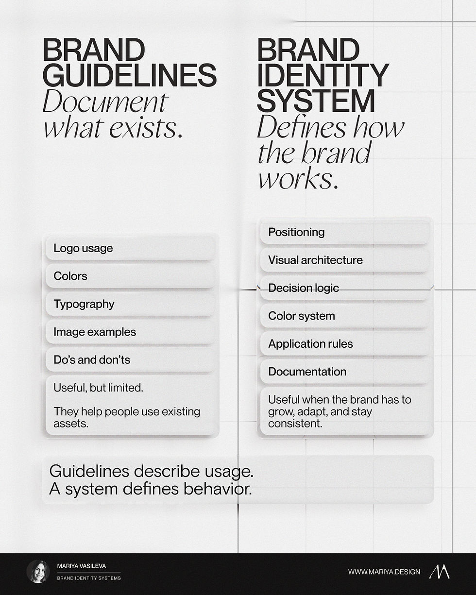
Brand identity system vs brand guidelines
Brand guidelines and brand identity systems are related, but they are not the same thing.
Brand guidelines usually document how existing assets should be used.
They often include:
logo usage
spacing rules
color values
typography
image examples
basic dos and don’ts
That is useful.
But guidelines usually describe decisions that have already been made.
A brand identity system defines how the brand should keep making decisions when the situation changes.
That is the key difference.
Guidelines may say which fonts to use.
A system defines how typography behaves across packaging, website, content, campaigns, and presentations.
Guidelines may show the color palette.
A system defines how color should support hierarchy, recognition, contrast, restraint, and variation across real touchpoints.
Guidelines may show a few layout examples.
A system defines how layouts should adapt when the format, message, or audience changes.
Guidelines document usage.
A brand identity system defines the logic behind usage.
For premium and luxury-led brands, that logic is essential. The brand has to feel consistent without becoming repetitive, flexible without becoming vague, and elevated without depending on individual taste every time something new is created.
What a brand identity system needs to solve
A brand identity system is not a longer guideline document.
It is not a bigger logo package.
It is not a folder of templates.
A useful system helps define what should stay consistent, what can flex, what creates recognition, what weakens the brand, and how the identity should behave across real customer-facing touchpoints.
A skincare brand with multiple product lines needs a different system from a premium service brand. A food brand competing on shelf needs different rules from a luxury-led wellness brand. A rebrand for an established company needs different decisions from an early-stage launch.
This is why a brand identity system cannot be copied from a checklist.
The visible layers may look similar from the outside.
The actual system depends on the brand’s market, category, pricing, product structure, customer expectations, visual equity, and future use.
How a brand identity system supports premium perception
Premium brands are judged through small details.
Spacing. Hierarchy. Materials. Color control. Typography. Photography. Packaging consistency. Website clarity. Language. The relationship between all customer-facing touchpoints.
When these details work together, the brand feels intentional.
When they work separately, the brand starts to feel less credible, even if each individual asset looks good.
A brand identity system protects premium perception because it defines how the brand should behave across the full experience.
It helps the brand avoid:
packaging that feels more premium than the website
content that feels disconnected from the product
campaigns that look like separate creative directions
templates that weaken the identity
product extensions that do not feel connected
vendor files that lose important details
repeated redesigns caused by unclear structure
The system turns visual direction into repeatable execution.
But the work is not simply listing the parts.
The difficult part is deciding which parts matter most for this specific brand, what should be preserved, what should change, and how the structure should hold across future use.

Example: SAE-REN Beauty Lounge
SAE-REN needed more than a logo or visual direction. The brand had to work across skincare, makeup, packaging, a physical beauty lounge, website design, production files, and vendor execution.
The identity system defined how the brand could stay consistent across luxury beauty touchpoints without treating every new product, page, or material as a separate design decision.
→ View the SAE-REN case study

When a brand needs a brand identity system
A brand identity system becomes necessary when the brand is no longer controlled by one person, one format, or one launch moment.
Common signs include:
the brand feels different across website, packaging, and content
new products do not feel fully aligned
social content no longer matches the quality of the offer
every design decision needs approval
guidelines exist, but people still interpret the brand differently
the brand looks polished in some places and weaker in others
a rebrand is being considered, but the real problem is unclear
the business has grown beyond the original identity
premium perception matters more than it did at launch
At this stage, another visual refresh may not solve the problem.
The brand needs clearer structure.

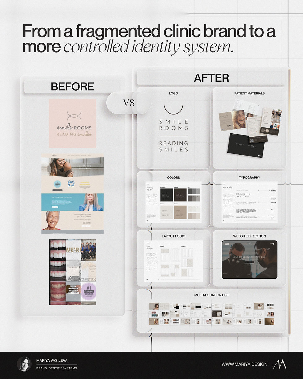
Example: Smile Rooms
Smile Rooms needed a premium rebrand that could hold across patient-facing materials, digital presence, and multi-location brand use.
The system helped the brand feel more consistent and recognizable without relying on one-off design decisions every time a new touchpoint was created.
→ View the Smile Rooms case study
Why a copied system does not work
From the outside, brand systems can look simple.
There are logos, colors, fonts, rules, layouts, templates, examples, and guidelines.
But the system is not valuable because those parts exist.
It is valuable because the right decisions have been made for the right brand.
A copied system usually creates the same problem it was meant to solve. It gives the brand more rules, but not more clarity.
The real work is diagnosis, judgment, prioritization, and translation.
What should the brand keep? What should it remove? What should become stricter? What should stay flexible? What needs to change before execution begins? What will create consistency without making the brand feel generic?
That is where a brand identity system becomes strategic work, not just visual organization.
Where to start
The right starting point depends on the brand’s current situation.
For an existing brand
If the brand already exists but feels inconsistent, unclear, visually weaker than the business, or difficult to apply across touchpoints, the first step is usually diagnostic.
The Strategic Brand Audit identifies what is misaligned, what should be preserved, and what needs to be refined or rebuilt before redesign, rebrand, packaging update, website refresh, or full identity system.
For a new or early-stage brand
If the brand is being built, launched, or reset, direction should come before execution.
The Brand Direction Blueprint defines the brand’s positioning, perception, visual logic, hierarchy, and decision rules before identity, packaging, website, campaign, or launch materials are developed.
For a brand ready to build the full system
If the direction is clear and the brand needs structured execution across multiple touchpoints, product lines, teams, vendors, or future applications, the next step may be a full brand identity system.
The Vault translates strategy and direction into a complete identity system with the visual identity, application logic, standards, documentation, and handoff needed for consistent execution.
Brand identity systems in practice
A brand identity system becomes useful when it holds across real touchpoints: packaging, website, content, product lines, vendor files, and customer-facing materials.

SAE-REN — Luxury beauty identity, packaging, and brand world

VKA — Rebrand and identity system for a growing brand

Smile Rooms — Premium rebrand and multi-location consistency
A brand identity system is not just a visual upgrade
A brand identity system is not more design for the sake of design.
It is the structure that helps a brand stay consistent, credible, and recognizable as it moves across packaging, website, content, campaigns, product lines, teams, vendors, and customer-facing materials.
For premium and luxury-led brands, this matters because perception is built through repeated signals.
A single beautiful asset can create attention.
A consistent identity system builds trust.
Need to understand whether your brand needs a rebrand, an audit, or a full identity system?
I’ll review your brand and recommend the right starting point.


