Why your website doesn’t match your packaging

Updated: Sep 12
When your website doesn’t match your packaging, the brand starts sending mixed signals before the customer has even tried the product.
A product can look premium in the customer’s hand and weaker the moment someone lands on the website.
The packaging may feel considered. The label hierarchy may be clear. The materials, photography, and product presentation may all support the price.
Then the customer opens the product page.
The typography feels different. The spacing is less controlled. The colors are used in a way that does not quite match the packaging. The product information is there, but the hierarchy is weak. The layout feels more like a template than the brand.
That mismatch creates hesitation.
The customer may not think, “The digital standards are missing.”
They are more likely to think:
“Something feels off.”
Packaging and website do not need to look identical. They do different jobs. But they do need to feel like they belong to the same brand.

When your website doesn’t match your packaging, the issue is rarely only aesthetic. It usually means the brand system has not translated clearly from physical product presentation into digital execution.
Packaging and website drift apart easily
Packaging and website work are often created in separate phases.
The brand identity may be developed first. Packaging may be designed next. The website may be built later by a different designer, developer, template, agency, or internal team.
That is normal.
The problem starts when each phase interprets the brand separately.
The packaging designer may understand the product range, materials, hierarchy, and shelf context. The web designer may only receive a logo, colors, fonts, and a few product images. The developer may be working inside a template. The founder may be adding content quickly because launch is approaching.
Nobody is necessarily doing anything wrong.
But the brand starts splitting.
One version exists on the product. Another version exists online. Another appears in social content, email, or sales material.
That is how a brand can look carefully built in one place and underdeveloped in another.
The issue is rarely that the website needs to copy the packaging.
The issue is that both need to follow the same identity system.

Packaging and website do not have the same job
Packaging has to work quickly.
It needs to identify the product, communicate the category, separate variants, show key information, support the price, and hold attention in a physical or digital shopping environment.
A website has a different job.
It has to build trust, explain the offer, support product education, organize content, guide the customer journey, answer objections, and make the buying decision easier.
So no, packaging and website should not be designed as identical objects.
The website does not need to repeat the label layout on every page. The packaging does not need to behave like a landing page.
But they should share the same logic.
The typography should feel related. The colors should have consistent roles. The image direction should support the same perception. The product range should be organized in a recognizable way. The hierarchy should feel controlled, even when the format changes.
The brand should not change character between the box and the screen.
When that connection is missing, the customer feels the gap even if they cannot name it.
Where your website doesn’t match your packaging
The mismatch usually shows up in practical places.
The packaging looks premium, but the product page looks generic. The label has careful spacing, but the website feels crowded. The packaging uses refined typography, while the website uses the same fonts inconsistently or relies too heavily on default styles.
Sometimes the product range is clear on pack but confusing online. Sometimes the color palette feels elegant in packaging, then becomes decorative or random on the website. Sometimes the photography is strong, but the surrounding layout weakens it.
These are not small details when the customer is deciding whether the product is worth the price.
For beauty, wellness, food, beverage, supplements, fragrance, and lifestyle brands, the product is often judged before it is tried.
The website has to continue the same level of trust that the packaging started.
If it does not, premium perception weakens.
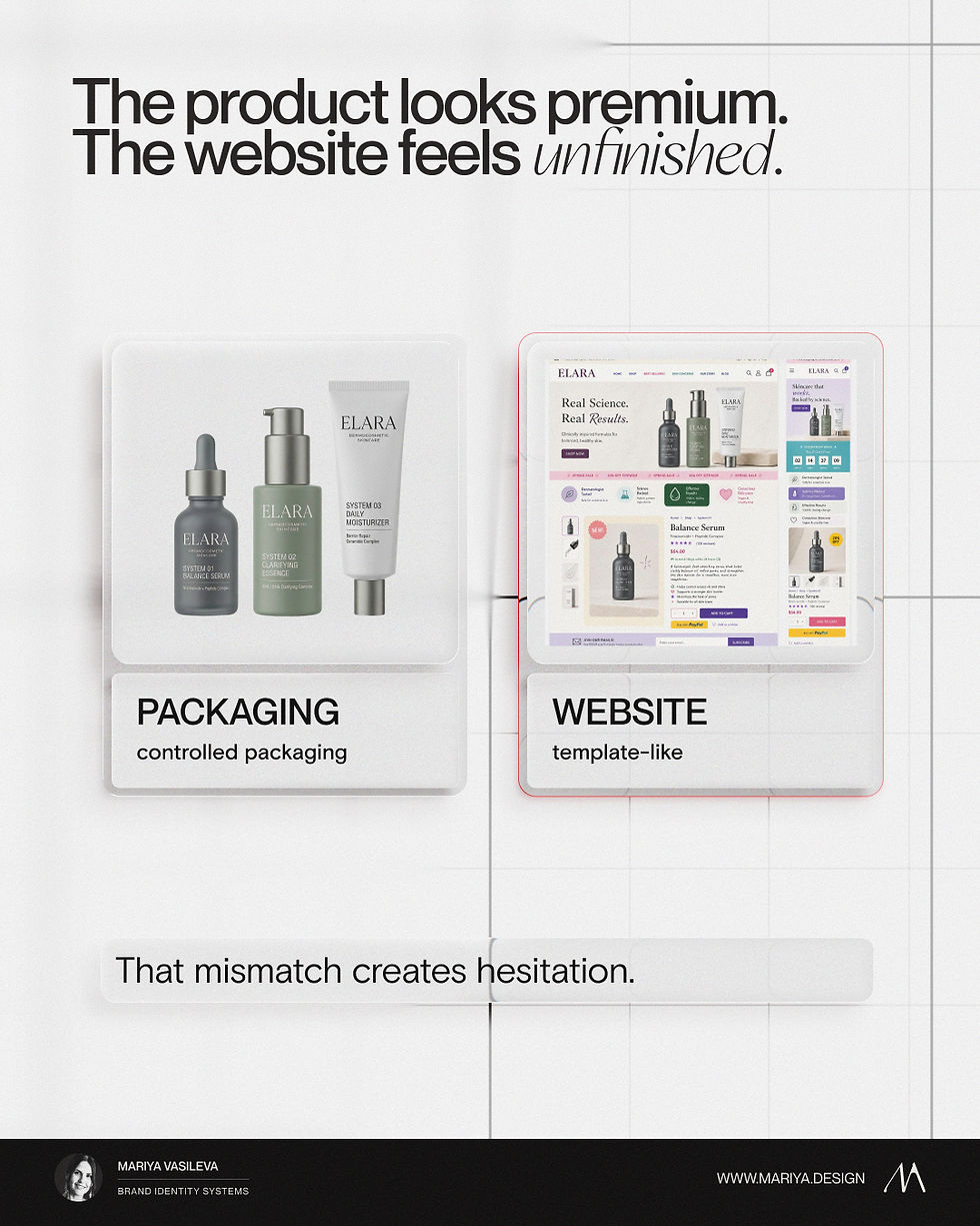
A premium package cannot carry a weak product page
A strong package can create interest. It can make the product feel credible, support shelf presence, and help the customer understand the product quickly. It can justify a higher price before the formula, flavor, texture, scent, or experience is known.
But packaging cannot do all of the work alone.
The product page still has to prove the value.
It needs to explain what the product is, who it is for, what makes it different, how it should be used, what matters most, and why the brand can be trusted.
If the product page looks like a generic ecommerce template, the packaging loses some of its power.
The customer starts receiving mixed signals.
The product says premium, but the website says unfinished. The packaging says considered, but the product page says assembled quickly. The brand says quality, but the digital experience says “close enough.”
That is the gap.
Not because the website needs to be more decorated.
Because the website needs the same level of visual discipline as the packaging.
Digital standards are part of the brand identity system
A brand identity system should not stop at the logo, color palette, and packaging examples.
For a product-led brand, digital standards matter because the website is often where the customer checks whether the brand is real, trustworthy, and worth buying from.
Digital standards define how the identity behaves online.
That includes typography, color roles, product page hierarchy, imagery, buttons, sections, product cards, campaign pages, and the way packaging hierarchy translates into digital hierarchy.
This is not about making the website rigid.
It is about reducing random interpretation.
A website can have more movement, more content, more interaction, and more conversion logic than packaging. It has to do more work.
But it still needs standards.
Otherwise, every new section becomes a new version of the brand.
The website may be the weak link, not the whole brand
A mismatch between packaging and website does not always mean the entire brand identity is wrong.
Sometimes the packaging system is strong. The logo works. The typography has potential. The color palette and product direction are not the issue.
The website may simply never have been designed with the same depth.
It may have been built quickly. It may be based on a template. It may have grown page by page without one clear structure. It may contain too much content and not enough hierarchy. It may rely on generic ecommerce patterns that do not match the product’s position.
In that case, a full rebrand may be unnecessary.
The better move may be website direction, digital standards, product page redesign, or a stronger bridge between packaging and digital.
This distinction matters.
A brand should not replace the whole identity just because one touchpoint is underperforming visually.
But it should not ignore the mismatch either.
The website is too important to feel like an afterthought.
Sometimes the mismatch points to a deeper identity problem
There are also cases where the website mismatch exposes a larger problem.
The packaging may look better because it was heavily art-directed as a single object, while the identity system underneath is thin.
This happens more often than founders expect.
A package can be solved beautifully in isolation. It can have a strong front panel, a good label, a good material direction, and a strong first impression.
But when the brand has to move into product pages, content, campaigns, email, sales material, and future product lines, the missing structure becomes visible.
There may be no clear typography rules. No color roles. No layout logic. No product architecture. No image direction. No guidance for how the brand should behave outside the packaging format.
The product looks good.
The rest of the brand has to guess.
That is when the problem is not only the website.
The problem is that the brand identity system does not give enough structure for future execution.
What to check before redesigning the website
Before redesigning the website, I would not start with the homepage.
I would look at the full brand first: the packaging, website, product pages, social content, photography, emails, product line, customer-facing materials, and the way the brand appears before, during, and after purchase.
Then I would check where the mismatch comes from.
Does the website use the same typography logic as the packaging? Are the colors used with the same roles? Does the product page hierarchy match the way the product is sold? Does the imagery support the same level of perception? Does the website feel like the same price category as the packaging?
I would also look at the practical execution problems.
Are product variants organized clearly? Are templates forcing the brand into a generic structure? Are calls to action visually appropriate for the brand? Are digital standards missing from the guidelines?
These questions are more useful than asking whether the website looks good.
A website can look good and still be wrong for the brand.
The real question is whether it supports the same perception as the product.

How packaging and digital should work together
Packaging and website should not compete.
They should reinforce each other.
Packaging gives the customer a physical signal of quality, category, value, and product structure.
The website gives the customer context, trust, explanation, proof, and a buying path.
Together, they shape perception before the product is experienced.
That connection needs a system behind it.
The color roles should carry across. The typography should feel connected. The imagery should support the same world. The product hierarchy should remain clear. The layout logic should feel intentional. The website should extend the brand, not reinterpret it.
That is where a brand identity system becomes useful.
It gives packaging and website a shared foundation, while still allowing each touchpoint to do its own job.
A premium product does not need every brand asset to look identical.
But it does need the customer to feel that the same level of care exists everywhere.
The package starts the promise.
The website has to continue it.
Packaging and website should not feel like two separate brands.
Tell me about your brand and I’ll recommend the right starting point.


