Why Your Beauty Brand Is Not Converting After Launch

Updated: Sep 29
At launch, the packaging, website, and campaign usually receive attention together. A few releases later, the picture can become less consistent. One product uses a new naming style, a campaign introduces a different palette, and a retailer listing puts the information in another order.
Each asset may look good on its own. The difficulty is what happens when a customer moves between them and tries to decide which product is right for them.
If your beauty brand is not converting as expected, look at how clearly those decisions are supported. Is the product type obvious? Is the main benefit clear? Can customers find credible supporting information and understand how the product fits into their routine?
Design is only part of the picture. Price, product suitability, the offer, traffic quality, and the shopping experience also affect the result. A brand review helps identify where presentation may be adding unnecessary confusion.
When the problem is bigger than the logo
A beauty range can grow through new formulas, shades, sizes, seasonal collections, and retailer formats. Each addition requires decisions about naming, color, imagery, and the order of information.
When those decisions are made separately, the range can become harder to navigate. A treatment and a moisturizer may look almost identical, while two sizes of the same product look unrelated. A campaign can be memorable without helping someone recognize the product when they reach the shop.
This gradual loss of connection is one form of brand drift. The useful task is to find exactly where it occurs.
Four places where beauty brands lose consistency
1. Campaign colors replace the brand's familiar signals
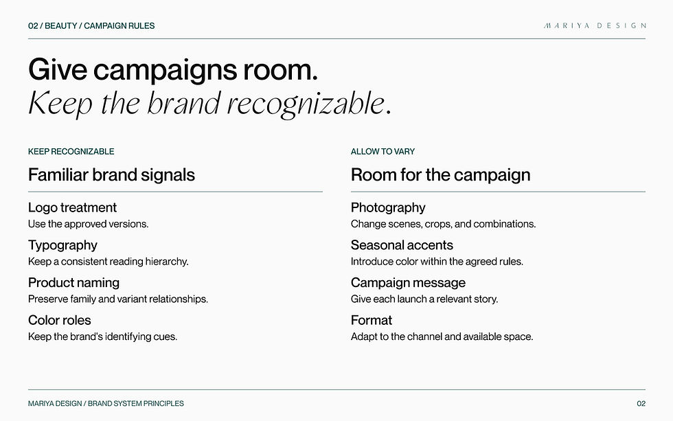
A seasonal palette can give a launch a distinct mood. If the logo treatment, typography, imagery, and color roles all change with it, customers have fewer familiar signals to connect the campaign to the range.
Decide which elements carry recognition and which can change for a campaign. That gives the creative work a clear starting point.
2. New products do not fit a clear family
A new formula, shade range, or sub-collection needs a place within the portfolio. Without consistent naming and visual relationships, customers have to work out the differences product by product.
Make the relationships visible: which products belong together, what distinguishes them, and where a new release fits.
3. Claims and promotions compete with product information
An ingredient percentage, a benefit, a certification, and a launch badge cannot all be the first thing a customer reads. When they have similar visual weight, the product itself can become harder to understand.
Choose the leading message, then place the supporting evidence where it is easy to find. Keep the distinction between what a product promises and the evidence supporting that promise clear.
4. Retail and digital versions stop matching
Packaging may be recognizable in person but difficult to identify in a retailer grid. A product page may shorten the name, change the imagery, or bury the benefit that leads on the pack.
Review those versions together. The layout can adapt to the space, while the product name, visual identity, and core information remain connected.
What does the customer need to understand?
For skincare in particular, a useful review starts with four questions: what is the product, what does it do, what supports the claim, and how should it be used?

These are content and design decisions. Clear typography cannot fix an unclear product distinction, and a strong ingredient story is less useful if customers cannot find it. Review the wording and its visual hierarchy together.
On a product page, the first screen should help someone identify the product and understand its main purpose. Further down, supporting detail can explain ingredients, evidence, usage, and suitability. The exact order depends on the product and the questions customers bring to it.
Give campaigns room without losing recognition
A useful brand system leaves room for photography, seasonal messages, creator content, and retailer requirements. It also makes clear what should remain recognizable across them.
That might include the logo treatment, typography, product-family naming, and the role of color. Examples should show how these choices work on packaging, product pages, campaigns, and retail materials.
The SAE-REN project brings identity, packaging, digital direction, and guidelines together. The applications below show the same brand across physical packaging and online touchpoints.

The handoff matters too. People creating the next launch need usable examples and current files, as well as a clear place to find them. Why brand guidelines fail explains why a document alone may not resolve the recurring decisions.

Would a rebrand solve it?
A rebrand can be useful when the positioning or identity no longer reflects the business. It should also address the practical questions that caused inconsistency in the first place.
If the product-family structure remains unclear or every campaign starts with new visual rules, those problems can return after a redesign. First establish whether you need a new identity, clearer applications of the existing one, or changes to the product story.
A practical beauty brand conversion check
Review the packaging, product page, routine information, retailer thumbnail, and campaign together. Ask:
Can customers identify the product type and main benefit quickly?
Do product families and variants follow a naming structure they can understand?
Is the main claim easy to find, with supporting evidence nearby?
Do campaigns retain enough familiar signals to connect back to the range?
Is the product still recognizable in a small retailer image?
Use the answers to identify specific gaps, then compare them with customer questions, feedback, and shopping behavior. For issues that extend beyond the brand's presentation, see the broader brand conversion diagnosis.
Start with the part that is not working
If your brand looks polished but customers struggle to compare products or understand the offer, another visual refresh may leave the same questions unresolved.
The Strategic Brand Audit reviews the brand, its applications, and the customer journey to help establish where the work should begin.
Share your range, what has changed since launch, and where you are seeing friction so I can recommend the right starting point.


