top of page

Tame Nutrition

Tame launched with research-backed nutrition and needed a brand to match. We developed a sharp visual system built to scale and convert.

Client

Tame Nutrition

Sector

Nutrition & Supplements, Start-up

Main Market

UK

Timeframe

2023, 4 weeks

Project Type

Vault Full

Deliverables

Packaging Design, Brand Guidelines, Brand Strategy, Logo Design

Executive Summary

Tame Nutrition LTD, founded by David Tame and Rita Eckensweiler, embarked on a journey to create a distinctive brand identity, strategy, and comprehensive guidelines to establish itself as a leading provider of premium sports nutrition supplements in the UK and beyond.

The Diagnosis

Tame launched with a strong product formula but no functional brand system. The early logo, colors, and layouts felt generic—closer to a DTC wellness trend than a research-based supplement. The founders needed to communicate restraint, clarity, and performance in both digital and physical formats. Without visual cohesion across packaging, ads, and landing pages, the launch risked blending into a crowded space. They had a vision. What they needed was a system that matched its depth.

The System

Discovery and Research

Understanding the Market

An in-depth market research was conducted to identify gaps in the sports nutrition sector, specifically targeting busy individuals with fast-paced lifestyles.

Founder's Vision

Personal experiences, ideas, and vision of David Tame and Rita Eckensweiler were studied to align the brand with their passion for quality, innovation, and sustainability.

Brand Identity Development:

Logo Creation

We designed a logo to reflect and emanate the brand's commitment to bring efficiency, novelty, convenience into sports nutrition.

The diligent creative process ensured TAME's logo resonates with brand ethos and that it matches the founder's vision.

Color Palette Selection

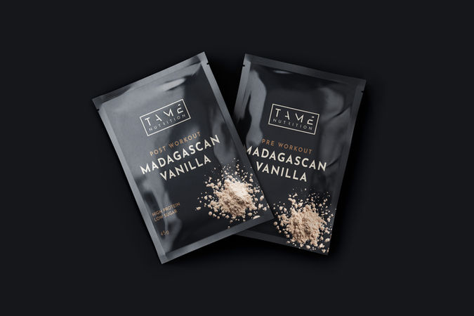
Carefully curated a color palette, incorporating Pale Brown, Wheat, and Activated Charcoal as primary colors, and Star Dust, Tiber, and Sanguine Brown as secondary colors, reflecting the brand's natural and dynamic essence.

Typography

A modern, clean font was chosen - Josefin Sans, one that communicates professionalism and readability, contributing to a cohesive visual identity.

Packaging Design

Sachets and Bottles

Designed sachet packaging with a minimalist yet vibrant approach, featuring the brand logo prominently and utilizing the chosen color palette to denote product variations.

Bottle design focused on functionality and aesthetics, incorporating tactile elements for easy handling and on-the-go consumption while maintaining brand consistency.

Eco-Friendly Materials

Prioritized sustainable packaging materials to align with Tame Nutrition's commitment to environmental responsibility, enhancing brand credibility and appeal to eco-conscious consumers.

Renders and Visuals

Prioritized sustainable packaging materials to align with Tame Nutrition's commitment to environmental responsibility, enhancing brand credibility and appeal to eco-conscious consumers.

Brand Strategy Formulation

Target Audience Identification

We defined the target audience as active individuals with hectic schedules and aimed to offer them convenient and effective nutrition solutions.

Unique Selling Proposition (USP)

A compelling USP was proposed, emphasizing Tame Nutrition's dedication to innovation, premium quality, and sustainability in its product offerings, positioning the brand as the obvious choice for supplementation on-the-move.

Messaging Framework

Developed a messaging framework that communicates understanding towards the challenges faced by the target audience and offers a solution to their needs.

Guidelines Book Creation

Logo Usage Guidelines

Issued specific guidelines for logo placement, proportions, and clear zones to ensure proper and consistent application along with logo don'ts.

Color Utilization

Detailed instructions were formed on the correct way to use primary and secondary colors across various brand materials to maintain a cohesive visual identity.

Typography Guidelines

Provided a comprehensive guide on font choices, styles, and usage, ensuring uniformity in all brand communications.

Imagery and Visual Elements

Outlined guidelines for selecting and creating further visuals that align with the brand identity, focusing on the active lifestyle and quality of supplementation.

Delivery Form

Here is what David received upon the completion of Tame Nutrition’s branding:

  • Brand book in PDF: 58 original content pages.

  • Tailored logo design in: AI, TIFF, JPG, PNG, EPS, PDF, SVG; for print and web.

  • Brand document and supporting digital materials; for print and web.

  • Related fonts and several bespoke presentation mockups.

The ROI & Outcome

Tame Nutrition's Brand Identity, Strategy, and Guidelines Book encapsulates a meticulous process of discovery, design, and strategic planning. By aligning the brand with founders' vision and goals, and by addressing the needs of its target audience with quality products, Tame Nutrition is established itself as a trusted and reliable choice in the sports nutrition market, especially for hectic personal schedules and on-the-move nutrition. The comprehensive guidelines serve as a roadmap for consistent and effective brand communication across all touchpoints, current and potential.

"Mariya was excellent! From start to finish an absolute professional: responsive, articulate and above all, very good at what she does! Thanks Mariya, look forward to working on some other projects."

David T.

Founder
Tame Nutrition

Client Thoughts 2.jpg
Clients thoughts 2.jpg
Ready to Build a System That Performs?


The Vault is the system that installs clarity and drives growth. Apply now to begin the process.

Ready to Build a System That Performs?

The Vault is the system that installs clarity and drives growth. Apply now to begin the process.
bottom of page