
Most palettes look good while they live as inspiration
The difficulty starts when the same colors need to work across packaging, websites, content, print, presentations, products, materials, and different production environments.
This workbook helps you move from:
“these colors look good together”
to a color system with clearer roles, stronger hierarchy, and more useful application logic.


Color inspiration becomes more useful when the relationships are understood
Cultural, botanical, material, and place-based palettes can be strong starting points.
The next step is deciding:
-
which color should lead
-
which colors should support
-
which color should create contrast or action
-
which color should provide space and clarity
The workbook helps you turn visual inspiration into a structure you can actually use.

A palette is not the same as a color system
A palette gives you colors.
A color system tells you how those colors should behave.
Without that structure, small decisions start to drift:
-
a social post uses the accent as a background
-
a vendor prints the main color too dull
-
a website button disappears
-
a new product introduces another “almost right” shade
-
one project uses white while another uses cream or pale grey
-
the strongest color starts appearing everywhere
Nothing looks seriously broken at first.
Over time, the brand, project, or content system becomes harder to manage.
The palette may be perfectly usable.
What is often missing is the logic that controls how the colors are applied.
Use the workbook to give every color a job
The Color Systems Workbook gives you a practical way to review your palette before it becomes scattered across packaging, digital, social, print, interiors, and production files.
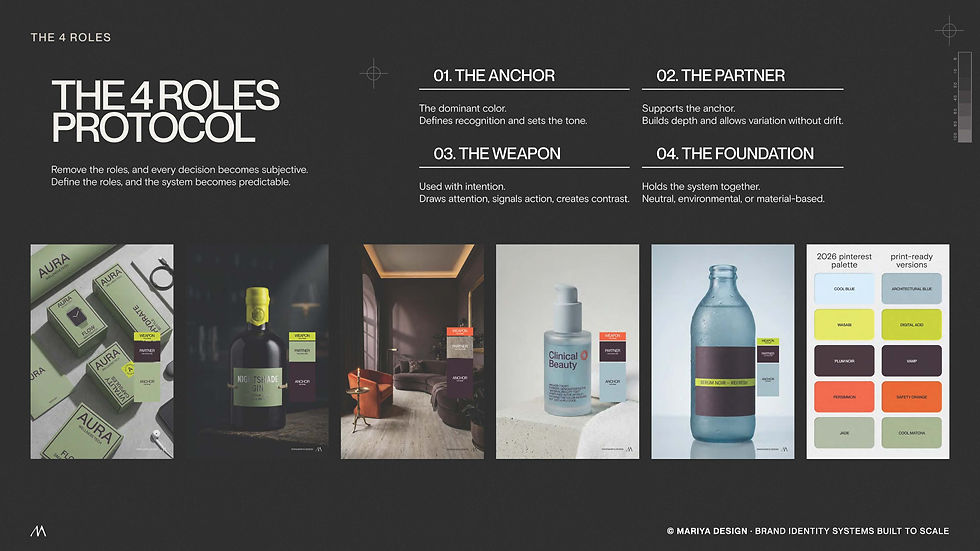
Inside the workbook, you will define four practical roles.
The goal is not to add more colors.
The goal is to make the colors you already have easier to use.
What the workbook helps you do
Use it to:
-
define the ANCHOR that creates recognition
-
choose the PARTNER colors that support the system
-
control the WEAPON color used for action or contrast
-
test whether the FOUNDATION protects clarity and legibility
-
review how the palette behaves across digital and print
-
check whether the hierarchy still works at different scales
-
spot early signs of color drift before they spread
-
identify colors that are currently doing too many jobs
What’s inside
The free workbook includes practical prompts, simple checks, and structured pages to help you turn color inspiration into a usable system.
You will get:
-
a four-role color framework
-
a palette workbench
-
hierarchy prompts
-
material and production checks
-
digital and print considerations
-
color system stress tests
-
examples of structured color use
-
practical questions for reviewing your own palette
Explore more color resources
The workbook helps you define roles, test hierarchy, and understand how your palette should behave.
For cultural color archives, rare palette collections, practical color tools, and resources for branding, packaging, interiors, content, and visual research, explore Color Systems by Mariya.
