Building and Evolving a Sports Technology Brand Since 2019
My work with Sports Timing Systems began in late 2019 with commercial and technical design, then expanded into a full rebrand, years of ongoing implementation, a major 2024 evolution and the current development of sport-specific digital experiences.
Client
Sports Timing Systems
Sector
Sports Technology, Professional Timing Systems
Main Market
UK
Timeframe
2019–ongoing · Rebrand, long-term Afterbranding, 2024 evolution and current discipline system
Engagement
Rebrand, Brand identity system, Visual production, Digital system, Afterbranding
What I created
Brand strategy and positioning, Logo and identity system, Brand guidelines, Website design and Figma prototypes, Custom 3D sport schematics, Custom and hybrid sport imagery, Marketing and technical literature, Sport-specific landing pages, Ongoing Afterbranding and digital implementation
The situation
Sports Timing Systems is an established UK specialist in digital timing and scoring, with experience dating back to 1990. I first worked with Dave in late 2019 on commercial and technical materials. The relationship soon expanded into a full identity and website rebuild, and I have continued working with STS ever since across branding, website graphics, marketing and technical literature, and new digital applications.
The value of this case is not a single before-and-after moment. It is what happens when the same identity is repeatedly tested against real products, sports, technical information and new channels over several years.
The problem
By 2024, the STS identity had been in active use for several years across web, marketing and technical communication. The next phase was not a restart. It was a refinement: keep what had become recognizable, expand the system for a wider range of sports and digital uses, and make increasingly technical information easier to navigate.
What the brand needed
The evolved system needed to do five things:
Preserve recognition from the 2019–2020 rebrand while allowing the system to evolve.
Support multiple sporting disciplines, products and technical use cases without creating separate visual identities for each one.
Make complex timing setups easier to understand through digital pages, diagrams and structured product communication.
Create a visual language flexible enough for websites, marketing, technical literature and new applications.
Refine the system when real use exposed new requirements instead of repeatedly starting over.
What was built
2019–2020 · Initial rebrand
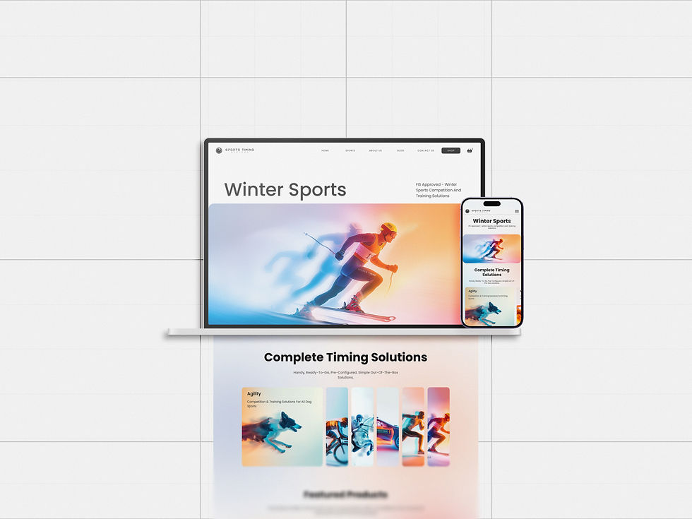
The first major phase established a new visual and digital foundation for Sports Timing Systems. I redesigned the logo system, introduced a more structured dark-blue identity, defined typography and colour, created brand guidelines, and redesigned the website and supporting applications. The stopwatch idea remained recognizable while the surrounding system became much more consistent.
Building bespoke sport imagery before generative AI
For the original website and marketing materials, I created custom sport visuals using 3D work, selected photography and Photoshop compositing. Reusable 3D elements allowed related visuals to be developed as a family rather than as disconnected one-offs. These images became part of the brand's visual language years before generative image tools became part of everyday design workflows.
2020–2024 · Ongoing implementation
The rebrand was not followed by a handoff and silence. I continued working with STS across website graphics, marketing materials, technical literature, product communication, landing pages and other digital applications. That ongoing use showed which parts of the system were durable and where later refinement would add value.
2024 · Brand evolution
After several years of active use, I evolved the identity rather than replacing it. The 2024 work refined logo configurations, expanded the colour architecture, introduced a more detailed desktop and mobile typography system, strengthened digital hierarchy, broadened the imagery direction and rebuilt the brand documentation around current use.
The updated brand book brought strategy, sport categories, logo use, typography, colour scales, imagery, technical schematics and web applications into one reference system.
A new production method for the sport banners
The newer sport banners moved to a hybrid AI-assisted and Photoshop workflow. Generative tools made raw image production faster, while composition, retouching, colour control and art direction remained part of the design process. The production method changed. The art direction did not.
Technical schematics remained custom 3D
The technical diagrams have remained custom 3D work throughout the relationship. I build sport-specific environments that show how sensors, displays, controllers, timing lines and scoring interfaces work together in recognizable competition settings. They are explanatory tools as much as brand visuals.
2025–2026 · Sport-specific digital experiences
The current phase extends the system into deeper sport-specific communication. Pages for disciplines such as Dog Agility and Equestrian combine suitable equipment, system components, technical explanations, competition context and custom 3D schematics inside one shared visual framework.
The work has therefore moved beyond visual identity alone into information architecture and product communication: helping customers understand the right timing setup for the sport they are working in while keeping the overall STS experience coherent.


The result
The strongest outcome is continuity under changing requirements. The identity established in 2019–2020 remained the foundation for years of ongoing communication, then evolved in 2024 without discarding the recognition already built.
The same core identity has supported years of website, marketing, technical and product communication.
The 2024 evolution expanded the system for a broader digital environment instead of replacing it with an unrelated direction.
The sport-image workflow evolved from custom 3D, photography and Photoshop into a hybrid AI-assisted and Photoshop process while keeping deliberate art direction.
Custom 3D schematics developed into a reusable explanatory language across multiple sporting disciplines.
Current discipline pages extend the brand into deeper product, technical and information design.
This project shows the difference between a rebrand as a one-time deliverable and a brand system that can be maintained, refined and extended over time.
“Mariya’s stunning ability to bring to life what I have in my head but unable to ever articulate is just amazing! Mariya has been managing all of my branding, website graphics, and general marketing and technical literature since 2019 and to an exceptionally high standard. So it was a no-brainer and a pleasure to invite Mariya to completely overhaul my branding, logo, and website content for a second time. Being able to give a brief to Mariya, then sit back and focus on my business is priceless, and I have to attribute some of the company's success and regular compliments on how professional and effective our website is, to Mariya.”
David J.
Founder & Director
Sports Timing Systems